Theme
Custom the visual appearance of the platform
Theme Configuration
Overview
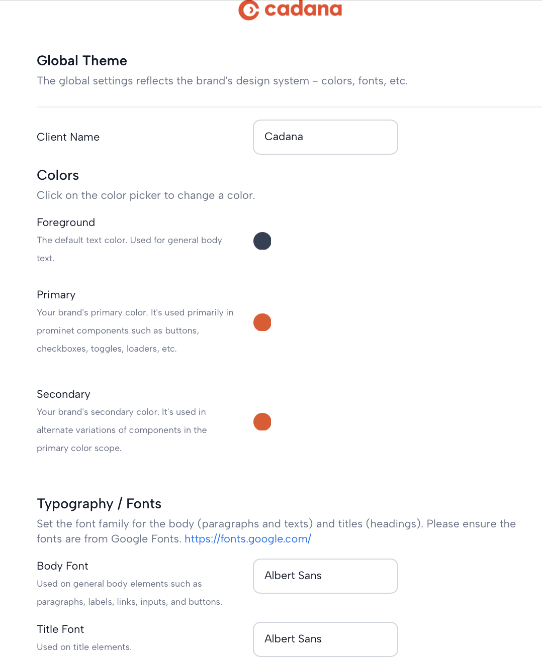
Customize the appearance of the white-label app with the theme configuration. Adjust colors, fonts, and the logo to align the user interface with your brand identity.
Colors
Use the color picker to select the appropriate colors for different elements of the UI.
- Foreground: The default text color used for general body text.
- Primary: Your brand's primary color, applied to prominent components like buttons, checkboxes, toggles, loaders, etc.
- Secondary: The secondary color of your brand, used in alternate variations of components within the primary color scope.
Typography / Fonts
Set the font family for body texts and titles. Ensure to select fonts from Google Fonts.
- Body Font: Applied to general body elements including paragraphs, labels, links, inputs, and buttons.
- Title Font: Used for title elements to make headings stand out.
- Logo: Include your brand logo, ensuring it is hosted on a reliable platform, like your website or a CDN. Prefer logos with a transparent or white background for better integration with the theme
Adjust the URL to point to your brand's logo for a personalized touch to the white-label app.
Quick Visualization Tool
Preview your theme configurations with the Theme Configuration Utility before applying them to the platform.
Updated 11 months ago